Originally published at: https://discgolf.ultiworld.com/2020/04/17/flight-numbers-pros-getting-better-putting/
 Photo: Alyssa Van Lanen – PDGA
Given that we aren’t expecting any new disc golf in the foreseeable future, let’s look backwards instead of forwards to get our fix. We may not have much UDisc Live data from 2020, but we still have the previous four years. So, let’s use it to take a closer look at how the pros are putting.
A common refrain one hears with regard to professional disc golfers is that they are getting better and better at putting. I find this to be an interesting statement, though before looking at the data, I was very skeptical. I thought this seemingly hot take1 was the result of convenience bias stemming from YouTube videos full of players on lead and chase cards canning putts from everywhere, whereas all the missed putts on card 12, for example, are not filmed.
Well, it turns out I was wrong. Pro players are, on average, getting better at putting. The FPO side has gotten better and fast(!), improving by about 1.8 percentage points per year since 2017. The MPO field has improved by about 1.2% per year.
I came to this conclusion by analyzing all of the Circle 1X putting data available on UDisc. I’ll leave the details for the footnotes, but basically I ran a form of regression looking at the relationship between time (in this case year, 2017-2019) and C1X putting,2 while controlling for the influence of individual players and events. I excluded 2016 because it had many fewer events than subsequent years.
I won’t really spend too much time on the implications of these results (but you should in the comments below) other than to say 1) I am very happy to not be the wet blanket by saying that your favorite pros aren’t getting better on the course, and 2) they could add some fuel to the fire of the smaller basket debate that is continually cropping up within the disc golf community.
It is quite interesting that FPO is getting better faster than MPO. There could be some amount of diminishing returns on the MPO side that explains these results, or FPO players are just working harder (wink wink). Another interesting difference between the fields is that in FPO the winners are the best putters. Whereas, in MPO the best putters usually finish a few places behind the winner.
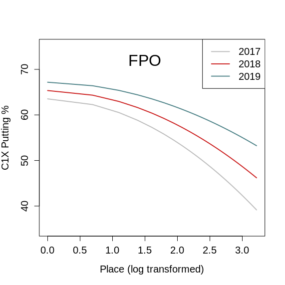
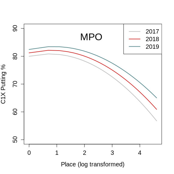
This pattern is evident in the plots below. Each year has its own line and for FPO the lines are at their highest values for winners. But for MPO the lines peak at finishers below first place.
I also investigated the relationship between finishing place and C1X putting, and the results are fascinating! While across the board players are improving in putting, the data suggests that those players who finish in worse positions are actually getting better faster than those who finish at the top.
You can see this pattern in the plot in two ways: 1) the difference between the lines is larger for lower finishers than higher finishers, and 2) as you go from 2017 to 2019 the difference between the winner’s value and lower place finshers’ values is getting smaller. In other words, putting percentage is compressing and there are fewer throws to be gained on the green.
The implications of this result are clear, at least to me. This C1X compression is further evidence for the primacy of tee-to-green performance in modern professional disc golf. How are winners of events going to separate themselves from the field? It doesn’t appear to be happening on the green because every year the field is catching up a little bit more.
Looking forward to the upcoming 2020 season, it will be interesting to see if this pattern continues. My guess is that it will. I think players at the top will run up against the diminishing returns of almost perfect putting, and with FPO players throwing farther and more accurately every year I predict their results will look more and more like those of MPO.
Luke warm take, maybe? ↩
Technically, I ran a generalized linear mixed model. Year (2017-2019), finishing place, finishing place squared, and the interaction between year and finishing place squared were fixed effects. Player and event were random effects. In other words, I included individual players and events to control for any of the influences they have on larger scale C1X putting patterns. When models like this have interaction terms, scaling can significantly influence interpretation, so I log transformed place. Don’t worry, transformations like this are very common and accepted in the sciences. I also ran these models further controlling for the different number of events in each year, but the results were the same. Finally, I took a look at field size to determine if that could be driving (or masking) any interesting patterns, but I found that field size for UDisc events haven’t changed much since 2017, which is consistent with patterns I’ve looked at in the past. ↩


