Originally published at: https://discgolf.ultiworld.com/2023/02/16/pdga-releases-new-logo-with-first-brand-refresh-in-25-years/
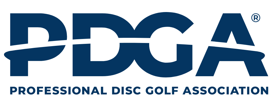
![]() The new PDGA logo.
The new PDGA logo.
The Professional Disc Golf Association has a new look but the same great taste.
After using the same logo and stylings since 1997, the PDGA has updated its primary logo with a simpler, modern design.
The new logo uses a sans serif font with the silhouette of a disc — or perhaps the flight of a disc — arcing across the letters of the PDGA. The colors remain similar to the previous logo. Per the PDGA, “The blues and greens that will accompany the new logo remain familiar, but brightened. Green symbolizes nature, health, optimism and growth. Blue is professional, stable, sincere and trustworthy.”
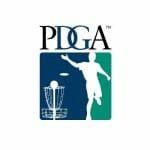 The old PDGA logo.
The process of developing a new PDGA logo took more than a year, and the new branding removes both the basket and the male figure. One of the core focuses was developing a brand with better representation of the wide populace of disc golf players. “As the current mark featured a silhouette of, apparently, an adult, caucasian male, the idea of a mark less ‘restrictive’ was influential,” wrote the PDGA.
Along with the colors, the updated logo keeps an additional element from the previous version: the connected DG letters in the middle. In the old logo, they fully crossed over each other; now, they are adjacent. The PDGA suggested that you might notice “the links of a basket’s chains” or “the connection of the disc golf community” in the tangential letters.
The PDGA is already using the new logo with different colorations — in all white on darker backgrounds and in a solid blue on the website homepage with a white background — and both with and without the full “Professional Disc Golf Association” text beneath the logo: